PROJECT GOAL: After two years in business, the owners of The Spoon Trade (TST) realized they needed a second location to do all of their scratch baking, to help them free up some much-needed kitchen space as well as open a sort-of second location. A perfect space opened up near the first location, and a new identity that was still linked to The Spoon Trade was needed. Grover Beach Sourdough (GBS) is the punk rock little brother of the more sophisticated but still admiringly cool TST.
PROJECT EXPERIENCE: During the colder months, Grover Beach is inundated with murders of crows. Thousands of crows fly in every morning and fly out every evening, in search for their favorite flavor of moth that comes out around dawn and dusk. It’s an amazing site every day in the fall and winter, and it’s unique to Grover Beach specifically. I pitched using the crow for the icon, because crows love bread too, and crows were perfect for a more edgy persona. Then we just needed to tackle another website with lots of beautiful photos.
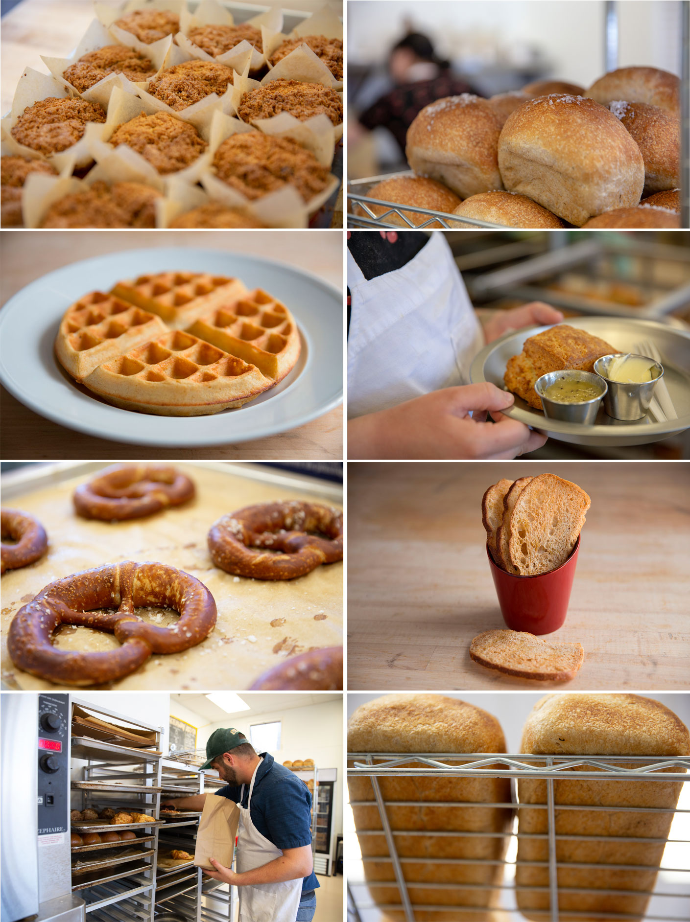
PROJECT OUTCOME: I came up with a few thumbnails and the owners posted a Social Media survey to ask which logo customers preferred. The crow won by a landslide. Again inspired by some of the interior design aspects, we went with a yellow and black color pallet. I used the same fonts in the logo as The Spoon Trade to ease in some brand recognition. I worked closely with the sign maker and also made a couple simple t-shirt designs for some extra merchandise. This website is much more image-rich and has much less copy than TST’s, so I did several food and product shots. The need for content management was also much less, so we created a clean WordPress site.
Creative direction, graphic design, web design and photography by Rebekah Venturini. Webmaster and WordPress coding by Michael Roullier.


